Visual Identity
Development of the visual identity and logo design for Vision Group, an industrial automation and electrical engineering company. The project focused on translating the company’s core values — technical precision, rational thinking, and integrated solutions — into a clear, structured, and long-lasting visual system.
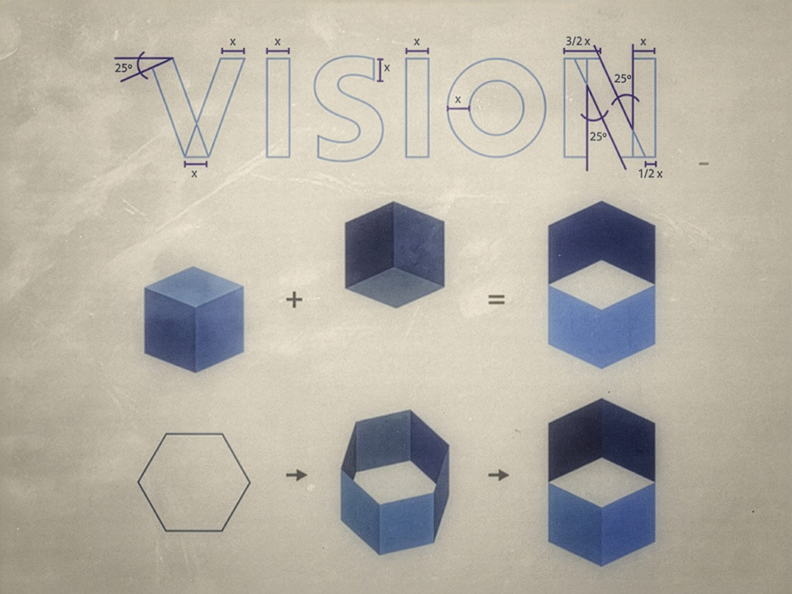
The logo was designed around geometric logic and proportional relationships, using straight, parallel lines to convey organization, reliability, and engineering accuracy. The symbol explores a controlled three-dimensional perception, suggesting multiple viewpoints and layers — a visual metaphor for systems thinking and problem-solving in industrial automation.
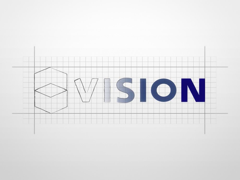
The visual identity was developed with a reduced color palette, using two shades of blue to reinforce clarity, intelligence, and technical confidence. The typography and symbol were designed as a unified system, ensuring legibility, balance, and consistency across different applications and formats.
In addition to the logo, a basic brand guideline was created to support consistent usage across print and digital materials. The identity has remained in continuous use since its creation, demonstrating its adaptability and long-term relevance.
Identity Concept
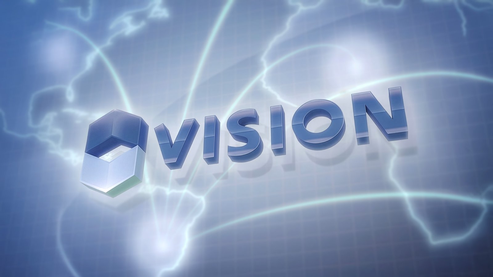
The visual identity for Vision Group was designed as a closed and coherent system, built to reflect clarity, precision, and structured thinking within the fields of industrial automation and electrical engineering.
The concept behind the logo is based on the idea of vision as the ability to perceive systems from multiple perspectives. The symbol explores a controlled three-dimensional perception, suggesting different points of view — interior and exterior, top and bottom — without relying on literal representation. This ambiguity allows the mark to communicate complexity and depth while remaining visually simple and stable.
Geometry plays a central role in the construction of the identity. Straight, parallel lines and proportional relationships were used to convey rationality, organization, and technical reliability. These elements reference engineering logic and system-oriented problem solving, reinforcing the company’s focus on integrated and efficient solutions.
The typography and symbol were designed as a unified visual structure. Rather than functioning as separate elements, they work together as a balanced composition, ensuring legibility, consistency, and ease of application across different formats and scales.
Color was intentionally reduced to a limited palette of two blue tones. This restrained approach supports visual clarity and reinforces associations with intelligence, trust, and technical confidence. The controlled use of color also contributes to the longevity of the identity, avoiding visual noise and short-lived stylistic trends.
The identity was conceived to be durable and adaptable. Since its creation, the logo has remained in continuous use without modification, confirming the strength of its underlying structure. The visual harmony achieved through proportion, geometry, and restraint makes unnecessary any formal adjustments over time — the system remains complete as originally designed.

